Good web design accomplishes a simple goal: conveying information to your users in the most effective manner possible.
This means that good web design is accessible, engaging, aesthetically pleasing, and unique.
Of course, everyone’s standards about what makes web design great tend to shift based on the trends. And if your website isn’t up-to-date on what’s new and exciting in the industry, well, you’re not going to stay new and exciting in the industry, are you?
That’s why we’re breaking down the biggest website trends. Keep reading to find out what your site should be doing before the year is up.
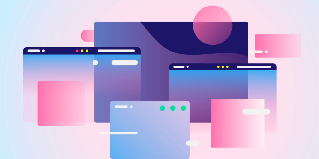
Illustrations
Illustrations have been a vital part of good web design for years, and a good reason. As it turns out, the human brain processes images 60,000 times faster than text, which makes sense when you remember that 93% of all human communication is visual.
But illustrations involve more than just hijacking the brain for marketing.
Illustrations are an opportunity for you to interpret your brand and tell a story through visuals. The tone of the illustrations sets user expectations as much as the actual content, and viewers will have an instinctive positive or negative response to images.
Great artists can pour a lot of personality into a single image, and that’s great news for brands, especially if your brand is typically viewed as serious, as it makes you more approachable to your customers.
Responsive Design
Okay, full disclosure: responsive web design isn’t a new trend, but it’s so important for web design that it’s still necessary to include it here.
The whole purpose of responsive web design is simple. You have one site, but with elements that respond differently based on the device that’s viewing them.
It’s done using a fluid grid, in which elements are sized based on proportion instead of pixels. So if you have three rows, you wouldn’t code the site to say how wide the rows should be–instead, you tell the site how wide the rows should be relative to each other.
That way, someone gets the same great experience on their smartphone, and they don’t have to bother zooming in and out.
Mobile First
Mobile-first isn’t just about making your customers happy. It’s also about making Google happy.
Since Google rolled out its Mobile-First Index, prioritizing good mobile design is now officially a prerequisite to good SEO performance. And now that mobile web traffic has officially surpassed desktop, you no longer have any excuse.
The good news for web designers is that mobile web design has grown into itself. It’s no longer awkward and clunky–you can now provide users with a clean, intuitive experience while still communicating all the necessary information.
Sure, you might have to ditch the big, gorgeous photos, but icons are economical (and they’re now so common that users won’t have any trouble understanding them).
Accessible, Inclusive Design
If you don’t have a disability, chances are that you’ve scrolled through hundreds of web pages without a second thought about whether that page might be hard to use for someone with disabilities.
Web designers of today are starting to do something about that.
More designers and leaders in the industry are beginning to offer tips on how to make web design more accessible regardless of who views your page.
Designers are also beginning to realize the importance of diversity and inclusion in the design and language of their websites and are going to greater lengths to showcase more racial and gender diversity in their imaging and language.
Multimedia Long-form
Listen, we get it. Creating long-form content is kind of a pain, especially when you’re trying to create multimedia content.
Here’s the thing: long-form content ranks well. And while Google isn’t knocking on our doors to wax poetic about why that is, it’s pretty easy to read between the lines.
Google strives to provide its users with content that answers their questions in the best possible manner, in the most extensive possible manner. That means that they’re going to reward sites that put out deep-dive content with expert-level detail.
Guess what? It’s hard to dive deep into anything if you’re taking the shortest route there.
It’s doubly important to do this with multimedia content because it’s the best way to make your website accessible. After all, everyone processes information differently–multimedia content is your best chance to engage with several types of learners at the same time.
Social Proof
A lot of the trends we’ve already mentioned come with a price tag–you need to assemble your design team and rewrite the code of your website.
The good news about social proof? It’s pretty much free.
Social proof refers to a psychological phenomenon in which people use the feedback and actions of others to determine right and wrong in a given situation. In business, your customers use social proof to decide whether to give their money to you or your competitor.
In web design, social proof is pretty simple.
It can be logos of companies you partner with. It can be testimonials from your happy customers.
It’s free, it’s easy, and most importantly, it generates trust in your brand.
Vibrant, Saturated Color Schemes
A lot of the web design trends we’ve discussed are all focused on one goal: standing out.
What easier way to do that than color?
If ever there was a year to go all in with color, here is it. We’re seeing big colors from big names like LinkedIn and Spotify, and it’s more than just vibrant (even clashing) colors–it’s about using color in reimagined, inventive shapes.
The endgame? Making an impression.
This goes a long way to sell a subtle psychological message: that your brand is willing to attract attention and take risks to be at the top of your game.
Using the Website Trends
Now that you know the best website trends (or our favorites, at least), it’s time to put that knowledge to good use.
And if you’re not sure what direction to turn first? No worries. That’s where we come in. Get in touch with us today to see how we can help your website flourish.